08 October 2010

Gap - a timeline of a new logo


It's been 3 days since Gap unveiled a new logo on their website and the dust has started to settle. However, things are still confused and the press has been quick to pick up on the public reaction (read internet reaction) to the new logo. Here's how things played out:


Tuesday 5th October

As ever, first to react were design bloggers, forums and Tweeters. I first saw comments on the new logo in the evening on tuesday 5th October. The first parodies appeared the same evening. Cue pastiches of the new logo replacing 'Gap' with any other word ending -ap: Crap, Snap etc.
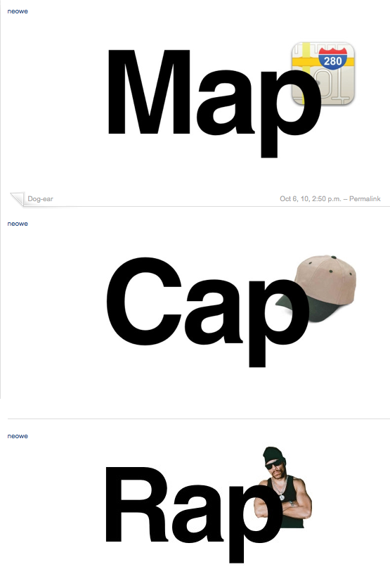


The logo was featured on yourlogomakesmebarf.com that same evening.


Wednesday 6th October

The next day everyone awoke to the new logo and the audience grew. Twtter was alight with comments and links to the previous night's blog entries.

A key blog entry has been on the iso50 site. They launched a logo redesign contest on wednesday which picked up momentum from its readership of designers. At time of writing there are a huge 238 entries.


Brand New reacted quickly along with other major branding blogs

.


As a response to all the negative reactions, someone set up a twitter account on 
behalf of the logo. It's written in his voice and is not the first anthropomorphic Twitter account for a logo, the iTunes10 logo having received its own in September.


The criticisms continued and then Gap broke their silence and posted this on their official Facebook account:


"Thanks for everyone’s input on the new logo! We’ve had the same logo for 20+ years, and this is just one of the things we’re changing. We know this logo created a lot of buzz and we’re thrilled to see passionate debates unfolding! So much so we’re asking you to share your designs. We love our version, but we’d like to see other ideas. Stay tuned for details in the next few days on this crowd sourcing project."


This is the point at which I think Gap lost quite a large amount of control. To confirm the new logo is one thing but to decide so quickly (1 day after launch) to create a crowd sourcing project seems a rather rash decision.


More mainstream sites picked up the news and it moved from being a design community story a more public one on sites like the Huffington Post and New York magazine

Not to feel left out the Old Gap logo then got its own Twitter account with some great tweets:

"Help…i've been taken hostage. Everything is dark and I don't know where I am."


Thursday 7th October

The next day reactions had built up momentum, with the previous day's blog posts and tweets being quickly spread.

All of this caused Gap North America's President, Marka Hansen to make a public statement on the Huffington Post, announcing that they will launch their crowd sourcing project in the next few days

Theories have been circulated that this whole exercise was a clever marketing exercise to bring media attention to Gap, involve the public and get them on side.


Friday 8th October

The story has been picked up by mainstream and print media, featuring on ABC's site, Fast Company, as well as lots of fashion media.


Brand New have published a great assessment of the story so far, including the anatomy public reaction to a identity launch (indignation, twitter accounts, logo contests):


It seems that with the advent of social media and such immediate criticism of new identities, launches must be handled very carefully, with great care to explain themselves in a wider context and involve the public.


If nothing else the backlash against rebrands of large consumer brands shows us that people feel passionately about their brands.


This type of reaction is nothing new, however it seems it's becoming more frequent, people like having their say and getting involved. What once was just a knee-jerk reaction, a chat around the watercooler, is spread around the world and redesigned within hours of launching.


The identity work is by Laird and Partners http://www.lairdandpartners.com/

19 July 2010

Stupid water


Water. We all need it to live, it's as simple as that. A basic human necessity.
For most, a simple glass of tap water is enough, a look into my local water board shows me that its treatment processes are enough to keep me happy that I'm getting clean drinking water delivered to my home, for a small amount per day.

Then there is the lucrative mineral water market, making people feel that this pure mountain filtered volcanic water is better for you, even though technically it contains more 'non water' elements (ie elements and compounds that aren't H2O).
This market has existed for a long time and seems to show no sign of slowing down.
On the contrary, if anything it is expanding into new and ever more stupid areas, testing the limits of human misunderstanding, preying of the most ill-informed members of society.

I'm talking not of soda, soft drinks and the like, but the new ranges of products that use and abuse the word 'water'.

These products actively use the word water for its healthy connotations with names such as 'Vitamin water' and 'Skinny Water'.

Of course as you might imagine, these products are anything but healthy.

Lets have a look at the nutritional information on these products and see what they contain, bearing in mind that water contains nothing nutritionally, 0 calories to be precise.

Vitamin water (591ml):


Let's just break down that table, and see some of the tricks at work here.
Firstly, one of the typical tricks used, the nutrition table is listed by 'Serving'. Of course, the bottle contains 2.5 servings. So even though you buy a bottle of 'water' you're supposed to only drink one third of it. Let's assume, like most people you drink the whole thing in one sitting, rather than save it over the course of 3 days.

You would take in 13g of sugar per 'serving' which in the whole bottle would be 32.5 grams of sugar. Doesn't seem like such a healthy product now does it?

'Skinny water' is as you would imagine much lower in sugar, I mean, it's called skinny water. But take a second to think about that name. Water is ZERO calories, so what could be more 'skinny' (ie low calorie) than no calories?
Well according to the nutrition information on the bottle, 9 calories is! Yep, skinny water contains 9 calories more than regular water, so how exactly is that skinny?

That brings us onto the Volvic 'A touch of' range. Presumably marketed at those who don't like the neutral taste of regular water, and want a chemical flavoured concoction.
To me this is the worst of the bunch. It's placed alongside the mineral waters in the fridge. It looks as close to the Volvic mineral water range as it can, and rides on the back of the healthy Volvic volcanic water campaigns. The drink is clear, not brightly coloured like, say, Vitamin Water (which is at least a clue to it being bad for you).
The big difference is that Volvic A Touch Of... contains a staggering 23 grams of sugar per bottle!
I'm sure there must be people out there drinking this drink, imaging it's actually good for them, which is why it's such a terrible piece of marketing.

So next time you're feeling thirsty, why not just go for some tap water, it's bound to me more healthy than this lot and let's not even get started on the environmental cost of transporting water around the world!

16 June 2010

Can 'green' brands work together for one cause?


Why do we need more green stuff?
The last thing the world needs right now is another product, we don't need more stuff. We need less.

If you really care then don't buy needless new products, re-use what you have and give money direct to charities who can more efficiently make some real change. Don't feel the need to get a 'thing' in return for your charity, that's just a selfish way of giving.

It seems like there are so many 'green' products out there, but the problem is, they are still products which are made in factories and have a carbon footprint. They're not helping anything.

How many excess canvas bags are there now in the world, because some genius decided to produce tons of them, poorly produced, probably made in china somewhere. They only last a few months, but definitely not a lifetime. A decent quality rucksack would be a better choice and was already on sale.

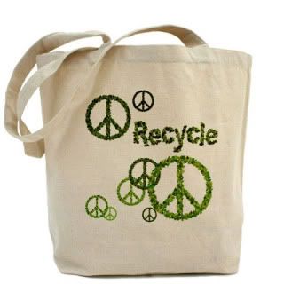
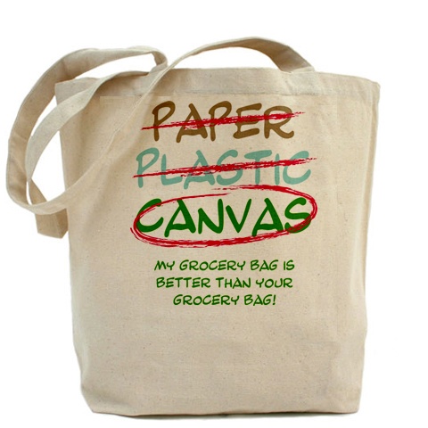
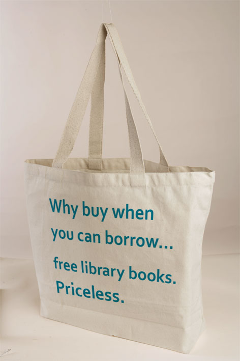
Come on, all of these (a small sample from Google) can't be needed, they cancel eachother out. which is my problem with most 'green' products:

http://i296.photobucket.com/albums/mm169/ecogreenbags/recycle_leaves_reusable_peace_sign_.jpg

http://loveisdope.files.wordpress.com/2009/02/canvas-grocery-bag.jpg

http://bagschat.com/wp-content/uploads/2009/07/juicy-couture-california-go-green-canvas-bag.jpg

http://talesofonecity.files.wordpress.com/2009/03/canvas-bag-2.jpg

http://www.promotional-products.org/components/com_virtuemart/shop_image/product/00223754.jpg

http://nordingarcia.com/tammy/images/CanvasBagDesign.jpg

http://www.fasttrackfundraising.com/images/canvas-bag.jpg

http://farm4.static.flickr.com/3450/3290680560_8d8509a6fa.jpg

In the UK there used to be lots of cancer charities that all competed for donations and did separate reseach, especially the two major ones. Then they decided that they had a common aim and should merge and share their research and work together, they formed Cancer Research UK funnelling more funding to one charity would help them all work to cure cancer. Now they are the world's leading cancer charity and do great work.

The same idea should happen with green products. One organisation curating green products, making sure they are truly green and produced in the best possible way. They should only sell the bare minimum number of products with the aim of reducing emissions with all money going to verified good causes.

A competitive capitalist market is really the enemy of the green ideal, we don't need lots of choice, just one good option. The 'green industry' is one market that would be improved by limited choices and less competition. A coalition with the same aims would be so much better.

So, nice bags, t-shirts, water bottles etc but I won't be buying, I have enough tshirts. I may donate to the gulf cleanup and other causes directly. Just remember that every product you buy announcing to the world that you are 'green' is still manufactured and will probably become tomorrow's rubbish.

12 May 2010

Saul Bass on the cost of aesthetics


Saul Bass, couldn't have put it better myself.

04 May 2010

Hand painted advertising murals

Recently the iconic DKNY mural in NYC's SoHo distract was removed :


Some don't realise that murals like this are still painted by hand in a minority of cases.
What used to be the main method for applying large-scale advertising is now a small industry of a few remaining practitioners.

This great documentary interviews a few of these painters and reveals how it's all done:

UP THERE from Jon on Vimeo.


Edit: here's a great site from the History of Advertising Trust called Ghostsigns, it's an archive of photos of old and fading hand-painted signs from around the UK. I'm glad someone is taking stock of the huge number of these old adverts that are still visible before they fade away completely.

http://www.hatads.org.uk/gallery/main.php?g2_itemId=33

29 March 2010

22 March 2010

Rebranding Playboy (theoretically)


This exercise in rebranding by San Francisco based designer Alex Cornell is a great piece of thinking.
He decided to give Playboy a new more upmarket positioning, more in line with Monocle magazine as opposed to Maxim magazine.

He gives a very detailed outline to the process of his design, and I think the finished article is just great. The perfect balance of humour and heritage, keeping just enough from the original mark, whilst signaling change.

You can read his overview on ISO50 blog:
http://blog.iso50.com/2009/11/24/rebranding-playboy/

and here's Alex's own site:
http://www.alexcornell.com/