24 September 2009

Charging brands for your time as a customer


Paul McCrudden, from my old employer Imagination, has started to invoice brands that he has interacted with for his time as a customer. A really interesting idea, the concept that we as regular, long term customers are of great value.
He has received payment from the the founder of Pret A Manger already for £62.
Read the full article on Paul's blog:
http://www.paulmccrudden.com/sixweeks.htm

Central Perk opens in London


To celebrate 15 years since Friends started (and presumably so sell some related merchandise/dvds) Warner Brothers have set up a replica of the Central Perk coffee shop from the show. It opens today and sells real coffee, located at 67, Broadwick Street at the end of Carnaby Street, it's an interesting promotional device, to deliver a tangible experience from something that we normally only see as an image on our tv sets. Sure to be a hit with 20/30 somethings everywhere, even if Friends has now become a round-the-clock staple of digital tv, once described quite accurately by someone as 'televisual mashed potato' – bland, but comforting and reliable.

Cadbury's Fairtrade campaign


I've noticed a recent and quite drastic change in Cadbury's advertising. A departure from the more recent abstract creatives (the drumming gorilla etc.). They have been acredited with the Fairtrade mark on the Dairy Milk bars. This is a big deal since Fairtrade used to be a niche concern, but this move by Cadbury's brings it to the most mainstream of mainstream chocolate brands, and pushes them above other brands like Mars and the ethically dubious Nestlé.

What's interesting is the ad campaign they are running, at first I thought it was an atempt to look 'ethical' and ethnic but after a tiny amount of reseach I discovered that it is in fact part of a larger campaign which involves Ghana. The poster features a mural like many that appear on walls all over Ghana. The mural in the ad is painted by a Ghanaian artist who comes from a family of cocoa farmers. They were painted for real on walls in Koforidua.


I'm intrigued to see where the campaign goes and how it is received but I'm impressed that as a brand Cadbury's are pushing the norms of a sector that is so often just about slow-motion shots of melting chocolate.

The campaign also includes the release of a single as well:


more info here:
http://cadburydairymilk.typepad.com/

Flash on the Beach 2009

On Wednesday 23d September I attended 'Flash on the Beach' which was held in Brighton at the lovely Dome Theatre. It's an annual 3-day conference of Flash developers and designers. My day there was incredibly inspiring. Covering subjects as diverse as visualising patterns of prime numbers to audience motion tracking and generative art.


First up I saw Mario Klingemann talking about his love of maths and geometry, showing a variety of ways of visualising complex patterns, including ways of finding patterns in prime numbers by ordering them in different arrays.
He also showed an ingenius experiement to use the 140 characters of Twitter to embed images, creating a flash program that compresses and interprets an image to condense it down to the correct number of bytes to fit the character allowance.
See here his 'Mona Tweeta': http://www.flickr.com/photos/quasimondo/3518306770/
http://www.quasimondo.com/

Other notable speakers were Andre Michelle for his incredible audio generation and experimentation lab.andre-michelle.com

And Jared Ficklin for his experiemental approach to visualising sound, using smoke machines and flames, he was like the very best kind of science teachers. He works for Frog Design http://www.frogdesign.com/


Closing out the day was self-proclaimed 'rock star' of design Joshua Davis. My impression of Davis' work had always been that it was a bit 'samey' he approached each project with the same generative method: he writes some parameters of his design in Actionscript, runs the program and curates the output. However seeing him present a range of his work, I realised there is much more to his process than this, such as work with other artists and social interaction projects, what really came across was his endless and unrelenting energy and passion for all things visual. Yes, his work is essentially illustration and I struggle to truly class the results as graphic design but the process itself is almost more interesting that the final artworks and that is why he continues to be of interest.
http://www.joshuadavis.com/

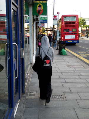
Glamour on the street


Spotted early in the morning in Finchley, North London. The statement belies the location.

11 September 2009

The anatomy of a brand

It's often difficult to describe the role of a brand designer. Consultancies are often given a hard time especially in the case of a public branding project (just look at the 2012 fiasco). People perceive a new logo as the culmination or even the sole result of a branding project and any associated cost is hung controversially on said logo.

For example, Wolff Olins' fee for 2012 is quoted as £400,000, which for the months of work for a medium-sized agency seem very reasonable. However, the media simplifies the project and arrives at the outrageous headline "£400,000 for a logo"
Cue, anger by the average man on the street, my kid could've done that for £400,000.

Branding of course is so much more than just a logo, in fact, the logo often comes as the finishing touch to a great deal of stategic thinking, business and market analysis, planning etc.
There are a host of cheap 'we'll-make-a-logo-for-you' websites eg these companies miss the point of branding completely (not to mention design!). The only way you can create a brand for a company is if you know some background information about them, their competitors, their future plans etc. Making a logo without creating the context in which it will live is pointless.

The logo is like the numberplate on a car, it's identification but it isn't the substance. If you want to update your car you need to do more than change the numberplate. You need to look under the bonnet, re-think the form and shape of the car, it's paint job, interior and everything else that goes with it.

One thing that is sometimes difficult to explain to people is the concept of a 'look & feel'. The look and feel (in my opinion), is everything visual or experiential about a brand aside from the logo. So colour, typography, supporting graphic elements, the movement and sound of the brand, the 3D design (environments) even tone of voice.

The best brands can be summed up by their look and feel alone with no need to show their logo. This explains the need for things like audio signatures (think Intel or Nokia), strong environmental design (you certainly know when you're in Apple Store and not because of the logo).

Here's a couple of colour and typography studies I created for a talk recently that sum up the look and feel of a brand without the use of a logo.


10 September 2009

Evian taste test


Still on the topic of water. I was having a conversation with a colleague about the merits of tap water versus mineral water. She was convinced she could taste the difference in a side by side comparison. I disagreed and said it was all in the mind, the power of marketing.

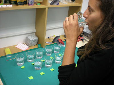
To settle this discussion I went out and bought a bottle of Evian and set up a very unscientific test. 10 glasses of water either bottled or tap for her to test.
I reasoned that testing only 2 glasses would leave too much to chance, the probability of guessing being too high at just a half.

So I set up the test, numbered the glasses and left her alone to fill out her answers on a post-it.

The results are impressive to say the least. She scored an amazing 9/10 correct. Although she did mention that there was a noticeable temperature difference in the waters so that may have given her some help.

On hearing about this another colleague said that he could also tell the difference, so he also completed the test, scoring a slightly less impressive 7/10.

What does this tell us? Well, not much since it was a tiny sample of people and equally small sample of water, but it did counter my expectations, my colleague lived up to her word.

My main issue is now having to work around a particularly smug individual!

09 September 2009

Brands in the subconscious

I recently decided that enough was enough, it was time to stop using disposable plastic water bottles. In a normal week I would buy one bottle of mineral water and then reuse the bottle, refilling it at the water bubbler until by the end of the week it had started to smell funny. I would then recycle the bottle and buy another one.
This cycle has lasted for a while, but I knew I should really just be using one permanent bottle.
So last week I got myself a lovely shiny blue Sigg bottle.
It was the obvious choice to me, it's metal and enamel lined to I can reuse it and scald it with boiling water to sanitise it each week.

This got me thinking, why was it an obvious choice?

I have never seen any advertising for Sigg products (that I can recall), I'm not a hiker or someone who they're targeted at, yet somehow I recalled the brand and it felt like the obvious choice.

Maybe it's because I was looking for a bottle for eco purposes and I knew Sigg was Swiss, which conjures up clean air and mountains. I'm interested in how brands can penetrate our subconscious and embed themselves comfortable, awaiting the opportune moment to make themselves known to us.


While we all think that we're immune to the daily bombardment of images and logos, the reality is that we absorb a lot more than we care to admit.

Thinking back to the times I've seen Sigg bottles tied to huge backpacks, those images and associations were all I needed to make my choice. The distinctive shape and form of the bottle only helped with this association.


On reading up a bit more about the Sigg brand is turns out they are pretty up on all things eco. They made special bottles for Radiohead and their crew for their tour. Their bottle design is in MoMA's permanent collection. I didn't know any of this until I read up on them but somehow it was implied in my subconscious when I made my purchase. I made a lot of assumptions which turned out to be spot on.


UPDATE: Interesting post about the history of dangerous chemical in Sigg bottels by Martin Bishop over at Brand Mix
SIGG's choice comes back to haunt ~ Brand Mix

08 September 2009

Br&. begins

After a significant time-out from my blogging activities I have resolved to recommence, and propose not to re-blog from other blogs but add opinion and criticism maybe even insight to the subjects I discuss.

My aim is to add content to the web rather than just regurgitate what's already out there. Original content, or at least original comment is my mission statement.

ready, set, go!