

It's been 3 days since Gap unveiled a new logo on their website and the dust has started to settle. However, things are still confused and the press has been quick to pick up on the public reaction (read internet reaction) to the new logo. Here's how things played out:
Tuesday 5th October
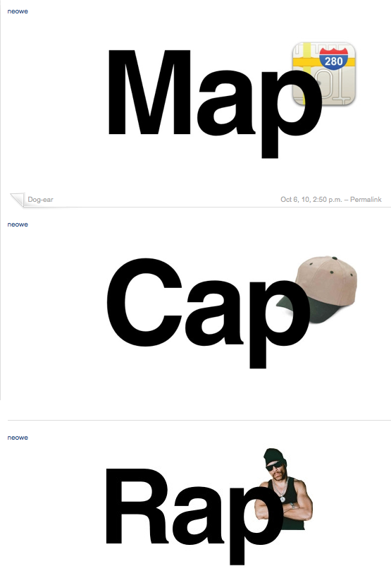
As ever, first to react were design bloggers, forums and Tweeters. I first saw comments on the new logo in the evening on tuesday 5th October. The first parodies appeared the same evening. Cue pastiches of the new logo replacing 'Gap' with any other word ending -ap: Crap, Snap etc.
The logo was featured on yourlogomakesmebarf.com that same evening.
Wednesday 6th October
The next day everyone awoke to the new logo and the audience grew. Twtter was alight with comments and links to the previous night's blog entries.
A key blog entry has been on the iso50 site. They launched a logo redesign contest on wednesday which picked up momentum from its readership of designers. At time of writing there are a huge 238 entries.
Brand New reacted quickly along with other major branding blogs .

As a response to all the negative reactions, someone set up a twitter account on behalf of the logo. It's written in his voice and is not the first anthropomorphic Twitter account for a logo, the iTunes10 logo having received its own in September.
The criticisms continued and then Gap broke their silence and posted this on their official Facebook account:
"Thanks for everyone’s input on the new logo! We’ve had the same logo for 20+ years, and this is just one of the things we’re changing. We know this logo created a lot of buzz and we’re thrilled to see passionate debates unfolding! So much so we’re asking you to share your designs. We love our version, but we’d like to see other ideas. Stay tuned for details in the next few days on this crowd sourcing project."
This is the point at which I think Gap lost quite a large amount of control. To confirm the new logo is one thing but to decide so quickly (1 day after launch) to create a crowd sourcing project seems a rather rash decision.
More mainstream sites picked up the news and it moved from being a design community story a more public one on sites like the Huffington Post and New York magazine
Not to feel left out the Old Gap logo then got its own Twitter account with some great tweets:
"Help…i've been taken hostage. Everything is dark and I don't know where I am."
Thursday 7th October
The next day reactions had built up momentum, with the previous day's blog posts and tweets being quickly spread.
All of this caused Gap North America's President, Marka Hansen to make a public statement on the Huffington Post, announcing that they will launch their crowd sourcing project in the next few days
Theories have been circulated that this whole exercise was a clever marketing exercise to bring media attention to Gap, involve the public and get them on side.
Friday 8th October
The story has been picked up by mainstream and print media, featuring on ABC's site, Fast Company, as well as lots of fashion media.
Brand New have published a great assessment of the story so far, including the anatomy public reaction to a identity launch (indignation, twitter accounts, logo contests):
It seems that with the advent of social media and such immediate criticism of new identities, launches must be handled very carefully, with great care to explain themselves in a wider context and involve the public.
If nothing else the backlash against rebrands of large consumer brands shows us that people feel passionately about their brands.
This type of reaction is nothing new, however it seems it's becoming more frequent, people like having their say and getting involved. What once was just a knee-jerk reaction, a chat around the watercooler, is spread around the world and redesigned within hours of launching.
The identity work is by Laird and Partners http://www.lairdandpartners.com/
http://www.horriblelogos.com/gap/
ReplyDelete